Key Takeaways
- The seven static ad formats worth copying in 2026 are product-first, testimonial, urgency promo, typography-only, before-and-after, UGC-style, and seasonal campaign ads.
- A product-first ad wins on clarity with one hero shot, and a testimonial ad converts cold traffic with a named customer and a specific result.
- An urgency ad needs a real deadline and a dollar figure to feel genuine, while a typography-only ad uses one provocative line with no image at all.
- A before-and-after ad sells transformation best when grounded by a specific metric or timeframe, a UGC-style ad earns attention by looking organic, and a seasonal ad works by matching the moment already on the shopper’s mind.
- GetHookd lets you find proven static creatives and rebuild them fast, using Clone Ads for instant variations and Image Ad Templates you can edit straight in Canva.
The Patterns Behind Every Static Ad Worth Copying
The static ads that win all follow one principle: do a single job, and do it exceptionally well.
That job might be a clean product hero shot, a customer testimonial, an urgency promotion, a bold typography-only statement, a before-and-after transformation, an organic UGC look, or a seasonal tie-in. Each of these formats earns its place by resisting the urge to say everything at once, because a static ad that tries to say too much ends up saying nothing.
The best formats also share a practical edge: they are cheap to produce and fast to test. Low production cost means you can run structured A/B tests across hooks, CTAs, and visual styles without burning through budget, which is why static ads dominate top-of-funnel prospecting and remain the workhorse of paid media.

GetHookd: Turn Competitor Intelligence Into Your Next Winning Ad
GetHookd reveals which ads your competitors are actively scaling—not just running. Spy on their best-performing creatives, landing pages, and traffic strategies, then turn proven concepts into testable campaigns in seconds with AI-powered script generation and creative cloning.
What You Get:- ✓ Brand Spy to decode competitor ad strategies in real-time
- ✓ AI script generation and ad cloning for instant variations
- ✓ Performance scoring based on actual ad behavior, not vanity metrics
- ✓ Creative Analyzer to identify and scale your top performers
Effective Static Ad Examples to Inspire You in 2026
1. A Product-First Ad That Leads With the Offer
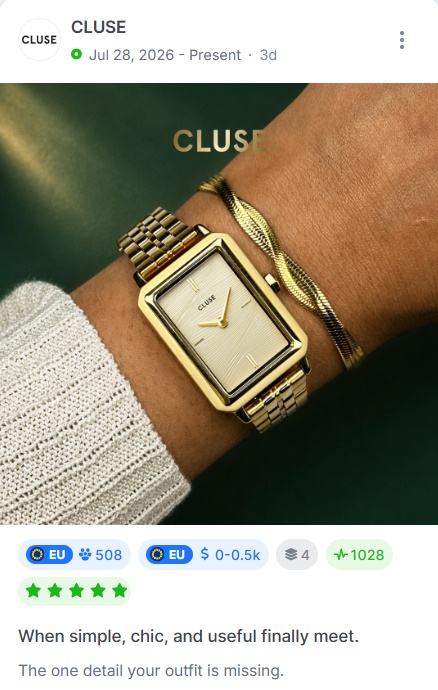
The product-first static ad is one of the most reliable formats in paid social. The entire frame is built around a single, hero-shot product image, isolated against a clean background, often with generous negative space that draws the eye immediately to what’s being sold.
What makes this format perform is its clarity. There’s no guessing what’s being advertised. A strong product-first ad pairs that clean visual with a single benefit statement positioned above or below the product.
2. A Testimonial-Driven Static Ad That Builds Trust Fast
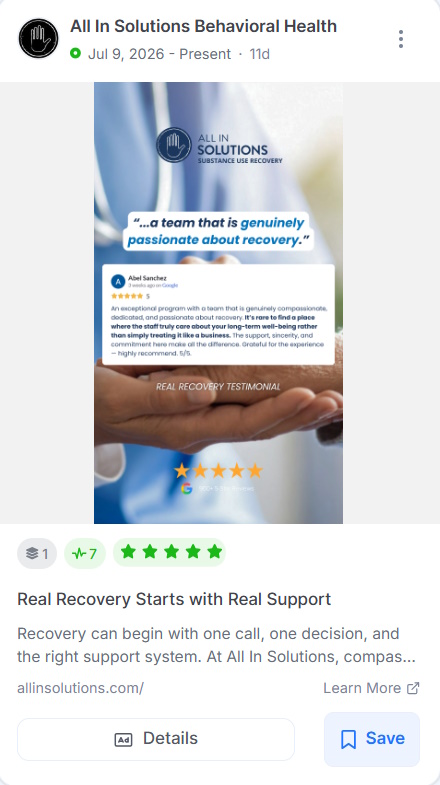
Social proof is one of the most powerful conversion levers available in paid advertising, and a well-executed testimonial ad puts it front and center. The format is straightforward: a real customer quote dominates the visual space, often paired with a star rating, a small product image in the corner, and minimal additional copy.
Specificity is everything. Vague testimonials like “Great product!” do almost nothing. Testimonials that name a measurable outcome drive clicks. For maximum impact, pair the quote with a real name, a location, and ideally a headshot.
3. An Urgency-Based Promotion Ad That Drives Immediate Action
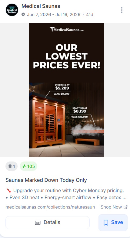
Urgency remains one of the oldest tools in advertising, and it still works because human psychology has not changed. A strong urgency ad gives people a real reason to act now.
The word that matters there is real. Fake countdown timers and hollow “limited time” claims have trained audiences to ignore them, so what works now is urgency that feels specific and true.
The best urgency ads lead with the offer in the headline. Think “48-Hour Flash Sale. 40% Off Sitewide,” and back it with a hard end date shown clearly in the creative.
The design leans on contrast, with bold type, high-energy color like red or orange on a dark background, and a CTA that jumps off the screen.
One detail elevates the format. Showing the dollar value instead of the percentage, so “Save $30 Today” over “30% Off,” tends to win in direct response because a dollar figure feels more tangible.
4. A Bold Typography-Only Ad That Relies Purely on Words
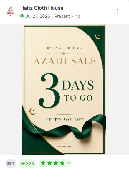
This format demands exceptional copy. There’s no visual to carry the weight, so every word has to earn its place.
The best typography-only ads use a single provocative statement or question that speaks directly to the audience’s pain point. Something like “Still paying for software that doesn’t talk to each other?” for a B2B SaaS brand, or “Your sunscreen is lying to you.” for a skincare disruptor.
The goal is to create an open loop the viewer has to close by clicking.
Font weight and hierarchy matter more here than in any other format. The primary statement should be set in a heavy, oversized typeface that fills the frame. A secondary line (shorter, lighter) adds context or reinforces the hook.
5. A Before-and-After Static Ad That Sells the Transformation
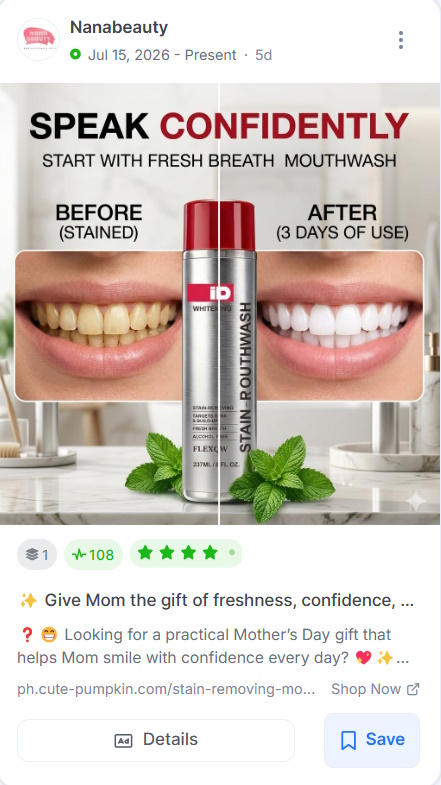
This image ad format is split-frame: the left side shows the problem state, the right side shows the transformed outcome. Simple, powerful, and almost impossible to scroll past when the contrast between the two states is dramatic enough.
The most overlooked element is the labeling. Adding “Before” and “After” in clean, readable typography seems redundant, but it dramatically increases comprehension speed, which matters when you have less than two seconds to communicate your value proposition.
The best versions of this ad also add a brief result statement beneath the after-image. A specific metric, timeframe, or outcome that grounds the transformation in reality rather than aspiration.
6. A UGC-Style Static Ad That Feels Organic in the Feed

User-generated-content-style ads are engineered not to look like ads, and that’s precisely why they perform so well in cold traffic environments.
A UGC-style static ad mimics the aesthetic of an organic post: slightly imperfect photography, casual handwritten-style annotations, a conversational caption, and no polished brand logo dominating the frame. It blends into the feed just long enough to earn attention before delivering the message.
The format works especially well on Meta and TikTok, where audiences have developed strong ad-blindness to overly produced creatives. A product sitting on a real kitchen counter, photographed on a smartphone with natural lighting, will consistently outperform the same product on a pristine white studio background, because one feels like a recommendation, and the other feels like an advertisement.
7. A Seasonal Campaign Ad That Taps Into Cultural Moments
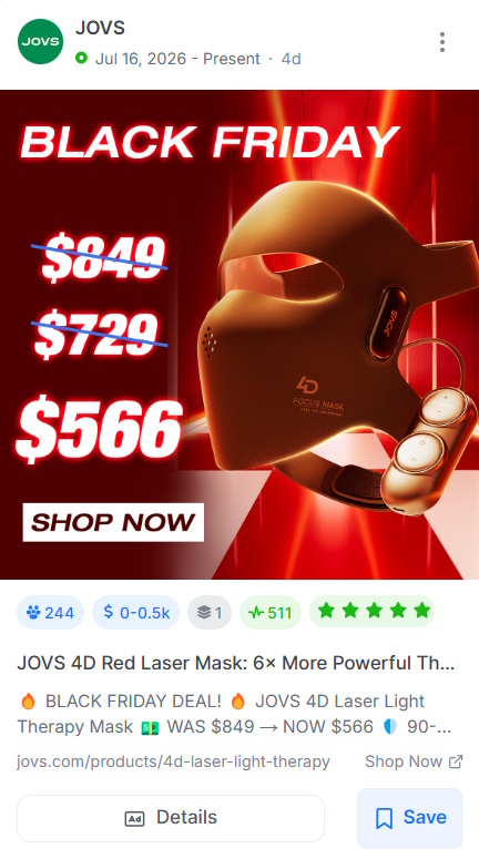
Seasonal ads work because they meet the audience where their mindset already is. When someone is already thinking about Black Friday deals, Valentine’s gifts, or back-to-school shopping, an ad that speaks to that context feels timely instead of intrusive, and that timing lowers the barrier to clicking.
The best seasonal ads rebuild the entire frame around the moment rather than pasting a holiday theme onto an existing creative. The color palette shifts, the headline names the occasion, and the CTA ties the offer to the season.
“Give the gift they actually want, free shipping ends December 20th” converts better than “Shop our holiday sale” because it combines seasonal relevance, personal resonance, and a hard deadline in one line.
Effective Static Ads Examples at a Glance
| Static Ad Format | Why It Works | Key Detail to Copy |
| Product-First | A clean hero shot removes any guesswork about what is for sale. | Pull one accent color from the product packaging to tie the image and copy together. |
| Testimonial | Social proof from a real customer beats any claim a brand makes about itself. | Attach a real name, location, and a measurable result to make the quote credible. |
| Urgency Promo | A genuine deadline gives shoppers a reason to act now instead of later. | Lead with the offer in the headline and show a hard end date in the creative. |
| Typography-Only | Words alone break the pattern of an image-heavy feed and force a read. | Set one provocative line in a heavy, oversized typeface on a flat background. |
| Before & After | A dramatic split-frame contrast makes the result impossible to scroll past. | Label both sides clearly and add a specific result beneath the after image. |
| UGC-Style | Content that looks organic slips past the ad-blindness of cold traffic. | Keep the photography raw and natural, and resist over-polishing the creative. |
| Seasonal | An ad matched to the moment feels timely rather than intrusive. | Rebuild the whole frame around the occasion, from color to copy to CTA. |
Create Scroll-Stopping Static Ads with GetHookd
A strong static ad comes down to intention, not budget or luck. A clean product shot, a specific testimonial, a real deadline, or a raw UGC feel can each carry an ad, and each one makes a single idea register in the split second a shopper decides to stop.
With GetHookd, you get access to over 65 million ads from brands in your space, so you can see which static creatives are pulling their weight before you spend a dollar testing. From there, Clone Ads turns a proven image into dozens of fresh variations, while our Image Ad Templates and Funnel Templates hand you a ready-made starting point for both the creative and the page it drives to. Start your GetHookd free trial today and build your next scroll-stopping static ad.
Frequently Asked Questions (FAQs)
Can a static ad be more effective than a video ad?
Yes, static ads load faster, communicate instantly, and require zero commitment from the viewer to absorb the message, whereas video demands time. For top-of-funnel prospecting, direct response promotions, and product hero shots, static formats are effective.
How many static ad variations should I test at once?
Three to five variations per ad set is the sweet spot for most campaigns. Fewer than three gives you too little data to draw conclusions, while more than five spreads your budget across too many variables and hides what is actually driving performance.
What ad dimensions work best for static ads on Meta?
The 1:1 square (1080 x 1080px) is the most versatile because it works across Feed, Explore, and most placements without cropping, while the 4:5 vertical (1080 x 1350px) takes up more mobile real estate and suits direct response well. For Stories and Reels, the full 9:16 vertical (1080 x 1920px) is essential.
How do I know when a static ad needs refreshing?
Creative fatigue shows up in the data before you feel it. The clearest signal is a declining click-through rate on an ad that used to perform well, especially when your targeting and budget have not changed. A rising cost-per-click on that same ad is the second flag worth watching.
Does GetHookd make it easier to produce static ads?
Yes, our Clone Ads tool spins a single winning image into dozens of variations in minutes, so you can test new colors, formats, and angles without a designer. Our Image Ad Templates give you ready-made static layouts that you can open and edit directly in Canva, turning inspiration into a finished ad in a single workflow.
*Note: Pricing and/or product availability mentioned in this post are subject to change. Please check our website for current pricing and stock information before making a purchase.