

Article-At-A-Glance
- Seven carousel formats consistently perform: product showcase, sequential storytelling, multi-product range, panorama, educational breakdown, social proof, and benefit stack.
- A product showcase carousel wins on consistency, since a shared template across cards keeps a viewer swiping once one product catches their eye.
- A sequential storytelling carousel turns the swipe into a narrative, opening with a hook and moving card by card until a closing frame delivers the CTA.
- Social proof and benefit stack carousels both convert through accumulation: one stacks reviews into evidence, and the other gives each reason to buy its own card.
- At GetHookd, we make it easy to study which carousel formats competitors are running across 65 million ads, then provide AI creative tools and ready-to-use templates to create your own version.
Why Carousel Ads Are One of the Highest-Converting Ad Formats
A single-image ad gives you one shot to make an impression, while a carousel hands the viewer a sequence of cards to swipe through at their own pace. That swipe changes everything, because a viewer who swipes is engaging. Facebook and Instagram read that dwell time and interaction as interest, then reward it with wider distribution and a lower cost per result.
The best carousel ad examples to try are product showcase, sequential storytelling, multi-product range, panorama, educational breakdown, social proof, and benefit stack. Each one uses the swipe differently, from building visual rhythm to walking a viewer through a story or a lesson. The right format depends on your goal, and the examples below show how each works and where it fits.

GetHookd: Turn Competitor Intelligence Into Your Next Winning Ad
GetHookd reveals which ads your competitors are actively scaling—not just running. Spy on their best-performing creatives, landing pages, and traffic strategies, then turn proven concepts into testable campaigns in seconds with AI-powered script generation and creative cloning.
What You Get:- ✓ Brand Spy to decode competitor ad strategies in real-time
- ✓ AI script generation and ad cloning for instant variations
- ✓ Performance scoring based on actual ad behavior, not vanity metrics
- ✓ Creative Analyzer to identify and scale your top performers
7 Best Carousel Ads Examples
1. Product Showcase Carousel
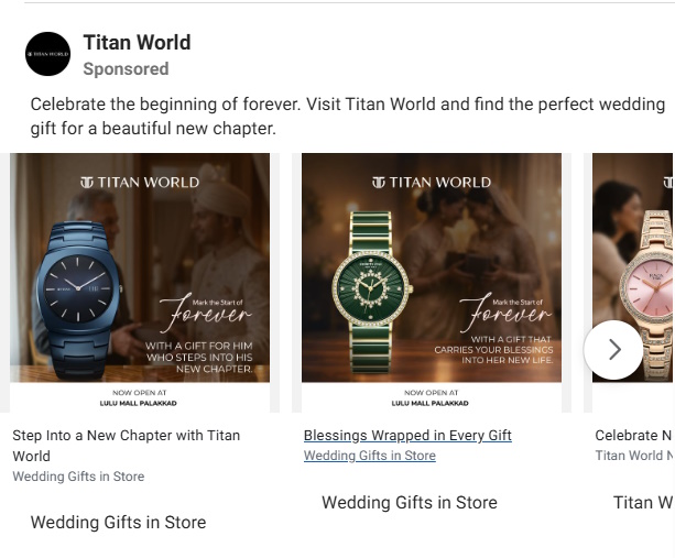
This is the most common carousel format, and when done right, it’s one of the most effective for e-commerce brands. The idea is simple: each card features a single product with a clean image, a punchy headline, and a direct link to that product’s page.
The strongest versions pair high-contrast product photography with a short descriptor and a clear “”Shop Now”” CTA on every card. A sneaker brand might show one colorway per card, each with a tight line like “”Lightweight. Breathable. Built for Speed.” Teams without a photography studio can have Higgsfield generate those shots with an AI Image Generator instead of booking a full shoot.
What makes this format work is the consistency. Every card follows the same visual template, same font, same logo placement.
That visual rhythm makes the ad feel polished and intentional rather than cobbled together. When one card catches a user’s eye, the consistency of the others keeps them swiping.
2. Sequential Storytelling Carousel
Instead of treating each card as a standalone unit, the sequential storytelling format uses the whole carousel as a single narrative arc.
Card one opens a loop with a problem, a question, or a bold statement. Each card after it moves the story forward, and the final card closes the loop with a resolution and a CTA.
Say a subscription razor brand runs this format. Card one asks, “Tired of overpaying for razors?” The next cards walk through the frustration of overpriced blades, the ease of a subscription, and the quality of the product, before a closing card offers a first box for a dollar.
A viewer who reaches the final card has read a full sales pitch, and they got there by choosing to swipe.
3. Multi-Product Range Carousel
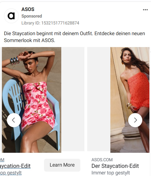
This format works differently from the product showcase in one key way: it’s designed to cast a wide net.
Rather than going deep on individual products, the multi-product range carousel gives a broad overview of an entire category or collection. ASOS uses this frequently during seasonal campaigns, showing 10 cards that span tops, bottoms, footwear, and accessories, all styled cohesively to communicate the full look of a collection in a single swipeable unit.
The strength here is discovery. Users who weren’t looking for a specific item often find something unexpected as they swipe. That element of browsing, which mirrors the in-store experience, consistently lifts click-through rates on catalog-style campaigns compared to single-product ads.
4. Panorama / Seamless Carousel
The panorama carousel is the most visually striking format on this list, and the most underused. Instead of designing each card as an independent unit, the panorama style creates a single wide image that extends continuously across all cards. Users see a sliver of the next card peeking from the right edge, creating an almost irresistible urge to keep swiping to see the full picture.
That curiosity gap is intentional. It turns passive scrollers into active participants, and the dwell time generated by users swiping to complete the visual consistently outperforms standard card-by-card carousel formats in engagement metrics.
5. Educational Breakdowns
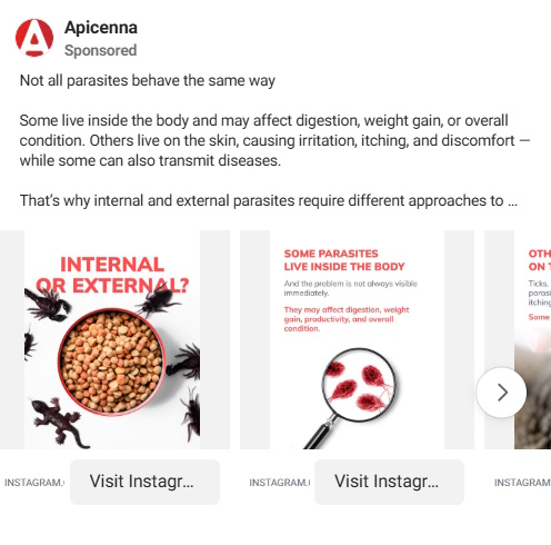
This format trades visual spectacle for practical value, and it works exceptionally well for SaaS brands, financial services, and any product that requires more than a glance to understand. Each card tackles one concept, one step, or one insight.
You can use educational carousels to break down marketing frameworks: card one states the concept, cards two through five each explain one component, and the final card links to a deeper resource.
The result is a self-contained learning experience that positions the brand as an authority before asking for anything in return. Users who reach the final card are pre-qualified as they’ve already invested time and attention, which makes them significantly more likely to click through.
6. Social Proof Carousel
Nothing sells a product like other people selling it for you. The social proof carousel dedicates each card to a different customer testimonial, review, rating, or user-generated content clip. The format works because it removes the brand’s voice from the equation and lets real customers do the convincing.
The psychology here is straightforward but powerful. Multiple pieces of social proof compound on each other. One testimonial is a claim. Five testimonials are evidence.
By the time a user reaches the final card, which typically features an aggregate star rating or a “Join X million happy customers” statement, the emotional case for purchasing has already been made.
7. Benefit Stack Carousel
The benefit stack carousel dedicates one card to each core benefit of a product or service. Rather than listing features in bullet points inside a single image, you give each benefit room to breathe.
You use a strong visual, a punchy headline, and a supporting line of copy. It works especially well for SaaS products, supplements, and subscription services where there are multiple reasons to buy but no single dominant one.
The reason benefit stacks convert is psychological: each card is a new reason to say yes. By the time someone reaches the last slide, they have been exposed to multiple value propositions without feeling like they read a wall of text. The format respects attention spans while still delivering depth.
Best Carousel Ads Examples: Summary Table
| Carousel Format | Best For | Key Strength |
| Product Showcase | E-commerce and retail | Direct product-to-purchase path |
| Sequential Storytelling | Brand awareness and DTC brands | Narrative engagement and loop closure |
| Multi-Product Range | Catalog brands and seasonal campaigns | Discovery and broad appeal |
| Panorama / Seamless | Lifestyle, travel, and luxury brands | Visual curiosity and dwell time |
| Educational Breakdown | SaaS, finance, and complex products | Authority building and pre-qualification |
| Social Proof | Any product with strong reviews | Trust and credibility at scale |
| Benefit Stack | SaaS, B2B, and subscription services | Clear value communication |
Design Carousel Ads That Convert With GetHookd
The seven formats here prove that a carousel’s power comes from how its cards work together. A product showcase builds rhythm, a storytelling arc pulls the swipe forward, and an educational breakdown earns attention before it asks for a click. Match the format to your goal, then let the swipe carry the viewer toward the action you want.
With GetHookd, you can search millions of live carousel ads to see which formats and hooks competitors are running right now. Our Clone Ads take one strong card and generate a batch of new versions; ready-to-use templates give you a starting point, and our Video Scripts feature writes a high-converting script if a card uses video. Try GetHookd for free now and build your next carousel on a format that already performs.
Frequently Asked Questions (FAQs)
Do carousel ads work better than single image ads?
For most objectives, yes, since the interactive format creates engagement signals that platforms reward with wider distribution. Single-image ads still have their place, especially for simple, high-urgency offers where the message is self-contained. A good rule is to use a carousel when your offer needs context or comparison, and a single image when it doesn’t.
What content works best in carousels?
Content that benefits from sequence performs best, where seeing one card makes the next more valuable. That rewards structured narratives, product comparisons, step-by-step breakdowns, and stacked social proof, while it works against generic brand imagery. Mixing formats within one carousel, like a video opener followed by image cards and a graphic CTA, is among the most effective approaches you can use.
Can you use video in carousel ads?
Yes, and you should consider it. Facebook and Instagram both support video cards within carousels, and you can mix video and static cards in the same unit. Keep each video card short, but long enough to loop naturally before the viewer decides to swipe.
What are common carousel mistakes?
The most common is designing each card in isolation, which leaves the carousel with clashing fonts and colors that make it feel disjointed and less trustworthy. Another is saving the CTA for the final card, since a softer prompt earlier keeps viewers moving before they drop off. Many brands also skip the hook, but card one has to stop the scroll or nobody sees the rest.
How does GetHookd support carousel ad strategy?
GetHookd lets you search a library of 65 million ads to see exactly which carousel formats and hooks competitors are using in your niche. When you find one worth modeling, our Clone Ads feature spins a strong card into new color and layout variations, and our Image Ad Templates open straight in Canva so you can swap in your own product and branding. You go from a proven concept to a finished carousel in one workflow.
*Note: Pricing and/or product availability mentioned in this post are subject to change. Please check our website for current pricing and stock information before making a purchase.